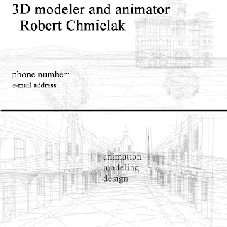
From all of them I like the last one. It's quite simple and clear. Maybe I need to work more with colours...
Tuesday 23 February 2010
Wednesday 17 February 2010
Business card idea
Unfortunately my scanner doesn’t work so I will not be able to show my sketches for business cards idea right now. However I have done some designing to show some of the ideas.
I wanted to keep the design simple so the style will not overload the text..
Before I started my work I had made some research. I found really interesting projects that inspired me.

(pictures underlined in red are the pictures I liked)
I really like the design and the colours that have been used. I wanted my business card to be simple but creative, here are examples:


I wanted to keep the design simple so the style will not overload the text..
Before I started my work I had made some research. I found really interesting projects that inspired me.

(pictures underlined in red are the pictures I liked)
I really like the design and the colours that have been used. I wanted my business card to be simple but creative, here are examples:


Task
My Task for this week was to produce images that would visualise our ideas for the theme. At the beginning Our first theme was ‘Nature’. For that theme I produced a simple picture that could help us to understand how this could look like and which things we should change.
We discussed about what we want to have in this scene and, of course, how this could be presented. We took under consideration many things like: money, lack of space, time etc
IDEA 1
This is the first visualisation of our theme. Very simple and, as we thought, easy to do. There is nothing difficult there. The background probably could be a mosaic displaying some environment. The scene also includes items like bench, stones, plants etc.
The information could be displayed on the left hand side- in the grass. As this could really fit the scene very well.

IDEA 2
We all agreed that our idea of the ‘nature’ theme is not really creative or artistic. It just looks like a simple exhibition of plants in the shop. We decided to keep on working on the idea of ‘nature’ theme but some changes were necessary. We just had to bring this theme to the next level. We came up with the idea that we could present some kind of spiritual journey of human. By using different colours and materials the scene could be interpreted in a few ways.
For the 3D modelling and Animation I have done the picture that matches our theme.

I made another very simple scene (based on the image above) to show a different way of presenting the scene.

We discussed about what we want to have in this scene and, of course, how this could be presented. We took under consideration many things like: money, lack of space, time etc
IDEA 1
This is the first visualisation of our theme. Very simple and, as we thought, easy to do. There is nothing difficult there. The background probably could be a mosaic displaying some environment. The scene also includes items like bench, stones, plants etc.
The information could be displayed on the left hand side- in the grass. As this could really fit the scene very well.

IDEA 2
We all agreed that our idea of the ‘nature’ theme is not really creative or artistic. It just looks like a simple exhibition of plants in the shop. We decided to keep on working on the idea of ‘nature’ theme but some changes were necessary. We just had to bring this theme to the next level. We came up with the idea that we could present some kind of spiritual journey of human. By using different colours and materials the scene could be interpreted in a few ways.
For the 3D modelling and Animation I have done the picture that matches our theme.

I made another very simple scene (based on the image above) to show a different way of presenting the scene.

Friday 5 February 2010
Ideas
During the first two weeks our group came up with couple of ideas for the ‘Exhibition’ module. Probably the theme of our project will be ‘Nature’ but this is something we will talk about later on.
As for now the group is thinking about how to present the theme. Our first idea is to use lights. The ambient light could be used to highlight the work when the surroundings are dark. So this could focus potential viewer on work. We all agree that using the spotlight could cause problems to clearly see the work.
The second idea was to use glass as material. The work would be divided into segments and situated in different places (depths) to achieve 3D visualisation. We agreed that it would be also a good idea to use the lights.
Another thing we were talking about was how to display the information. It could be displayed on the floor, in the centre of the image or in the borders.
CV
After yesterday lecture I came across some ideas. I now know that CV shouldn’t be overloaded as it may be to confused but in the same time it cannot be too simple because as a creative person I must show some of my creativity. My fist idea is to use, maybe, 2 nice pictures of some of my work, just to show some of my skills. I also thought about using the background image, so the information would be displayed on in the picture.
I will try to make both of them and see which one is better...
Subscribe to:
Posts (Atom)


